The Challenge
A bold, futuristic identity for Dublin's fastest growing club night.
The Concept
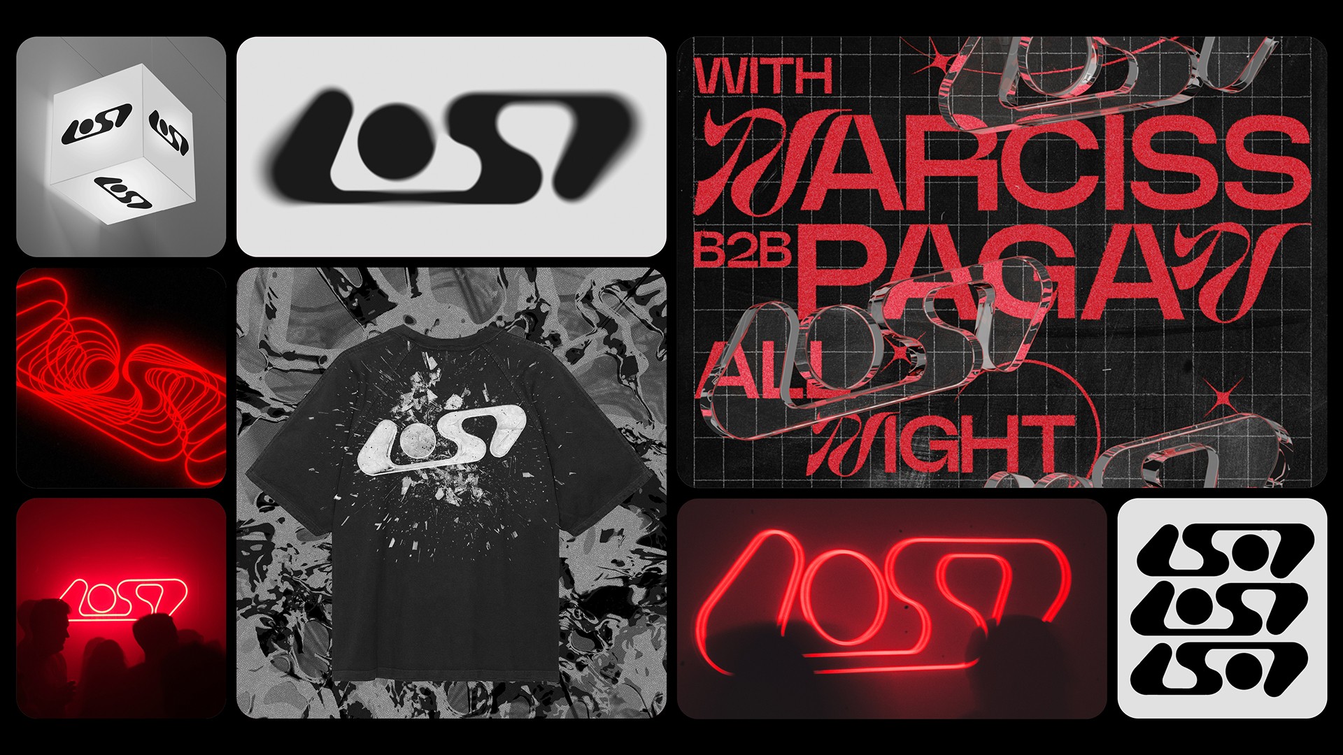
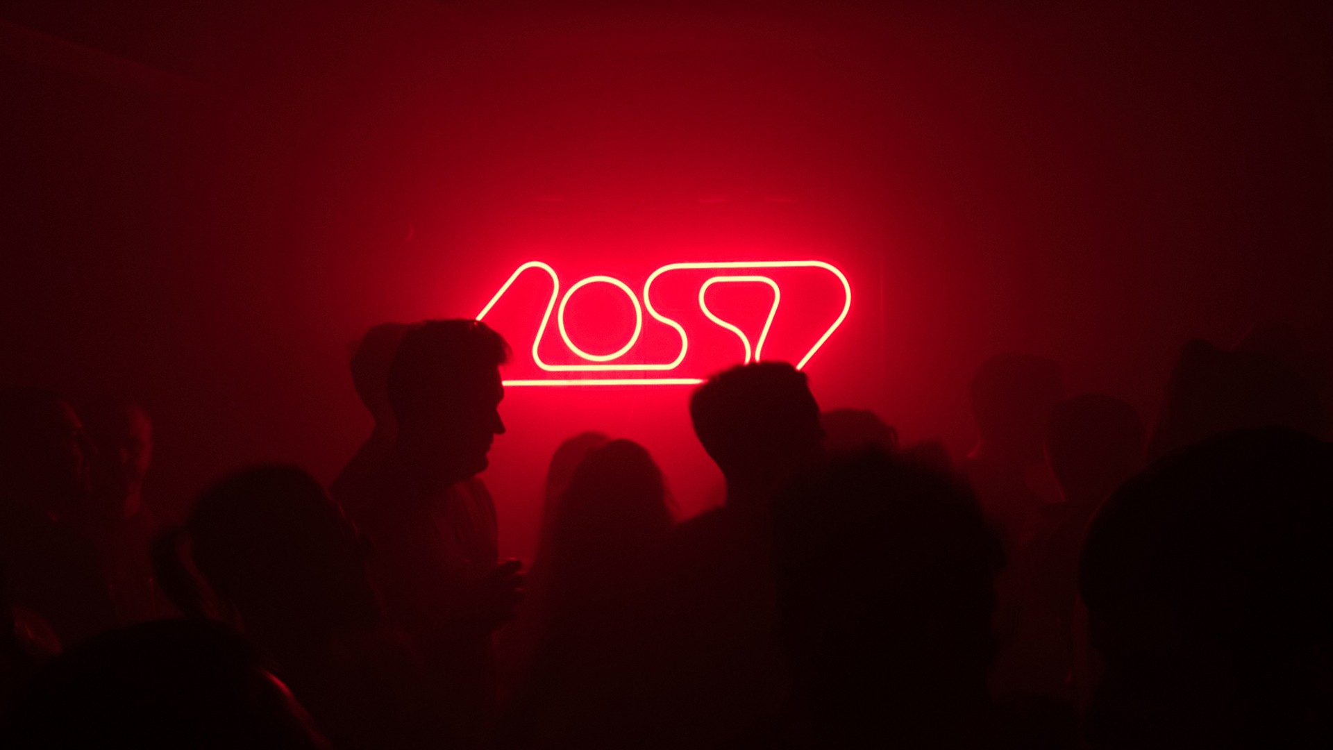
The final mark is striking, versatile, and future-facing. It adapts seamlessly across motion graphics, 3D environments, streetwear, neon signage, and print. Whether animated, embossed, or illuminated, the design maintains a strong visual identity that resonates with LOST’s audience and ensures consistency across every touchpoint.
Process
Designing the LOST logo was a collaborative effort with a team that values design and came prepared with their own mood boards. Building on this groundwork, I explored abstract futurism, Y2K aesthetics, and 90s dance logos - aiming for something modern that avoided cliché bubble text while still nodding to that era’s spirit.

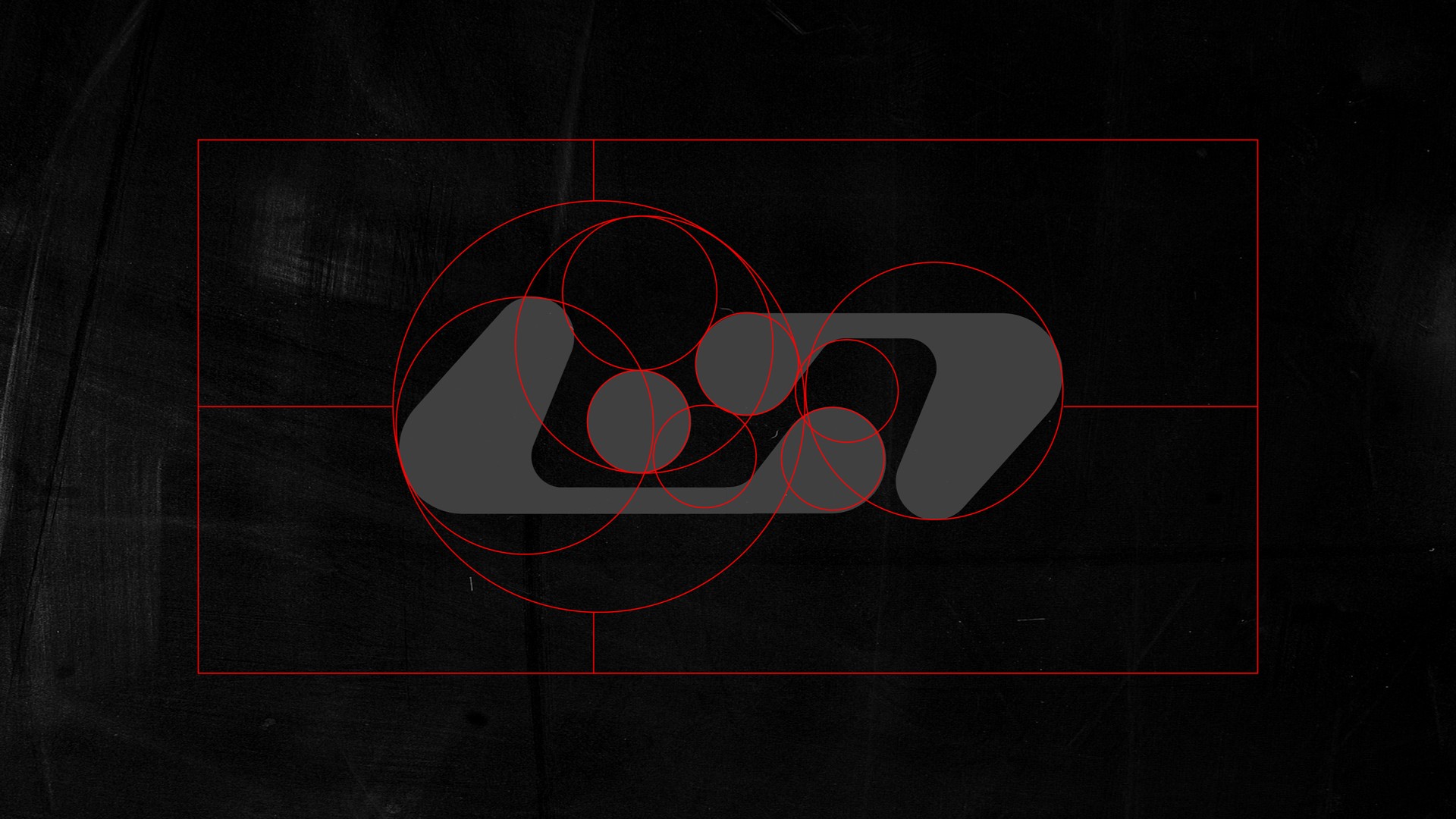
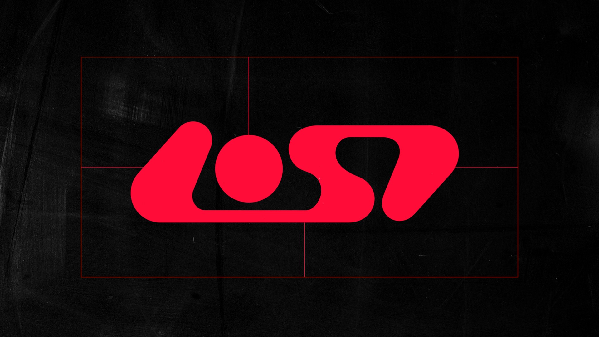
Over six weeks, I developed sketches that played with the idea of the word ‘LOST’ being hidden at first glance but unforgettable once seen - reflecting the experience of the club itself. An early concept based on golden ratio circles was considered too abstract and too far from the existing brand. That feedback led to a refined version, bridging the missing ‘S’ and striking the right balance between evolution and recognition.